Inphonite Navigation Restructure
A complete overhaul of Inphonite’s navigation system to improve usability, logical grouping, and interface clarity, aligning legacy architecture with a new Kendo Telerik–based design system.
Context
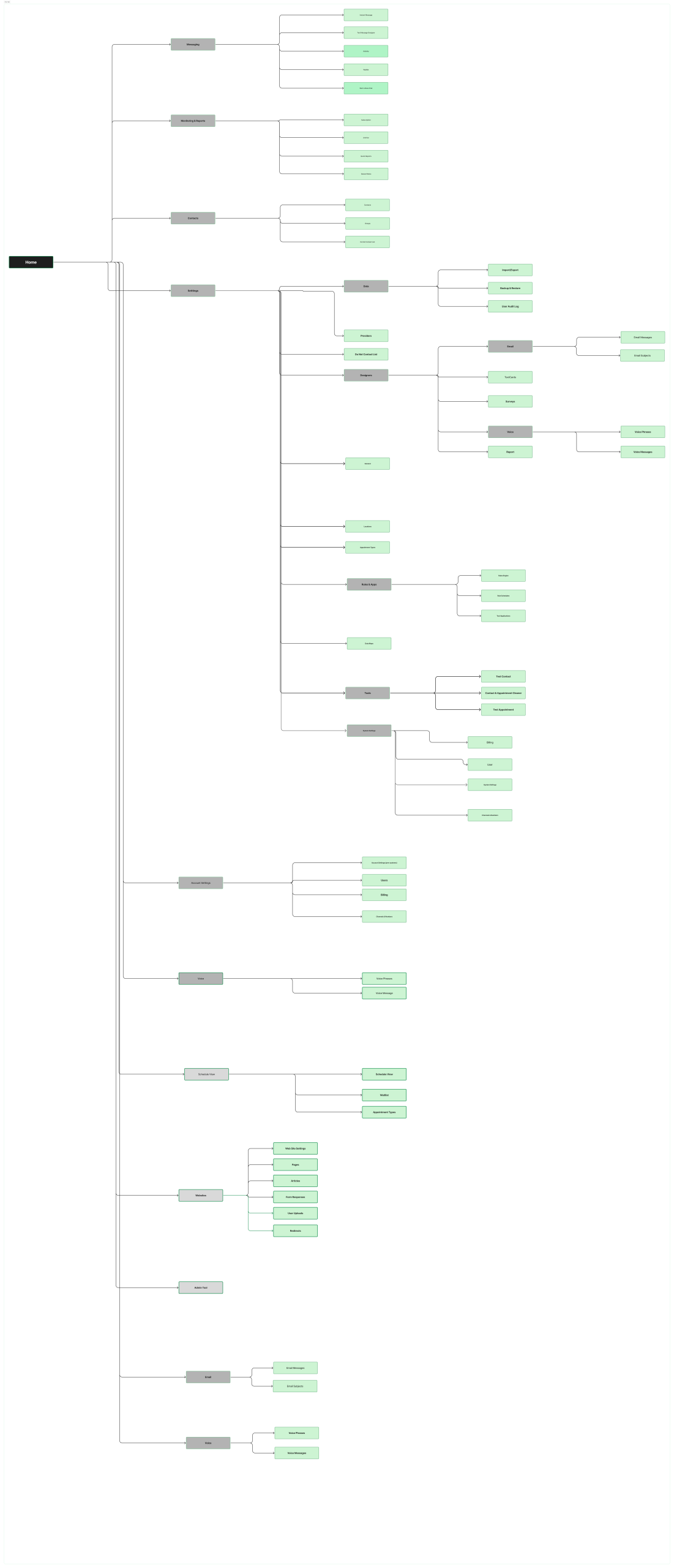
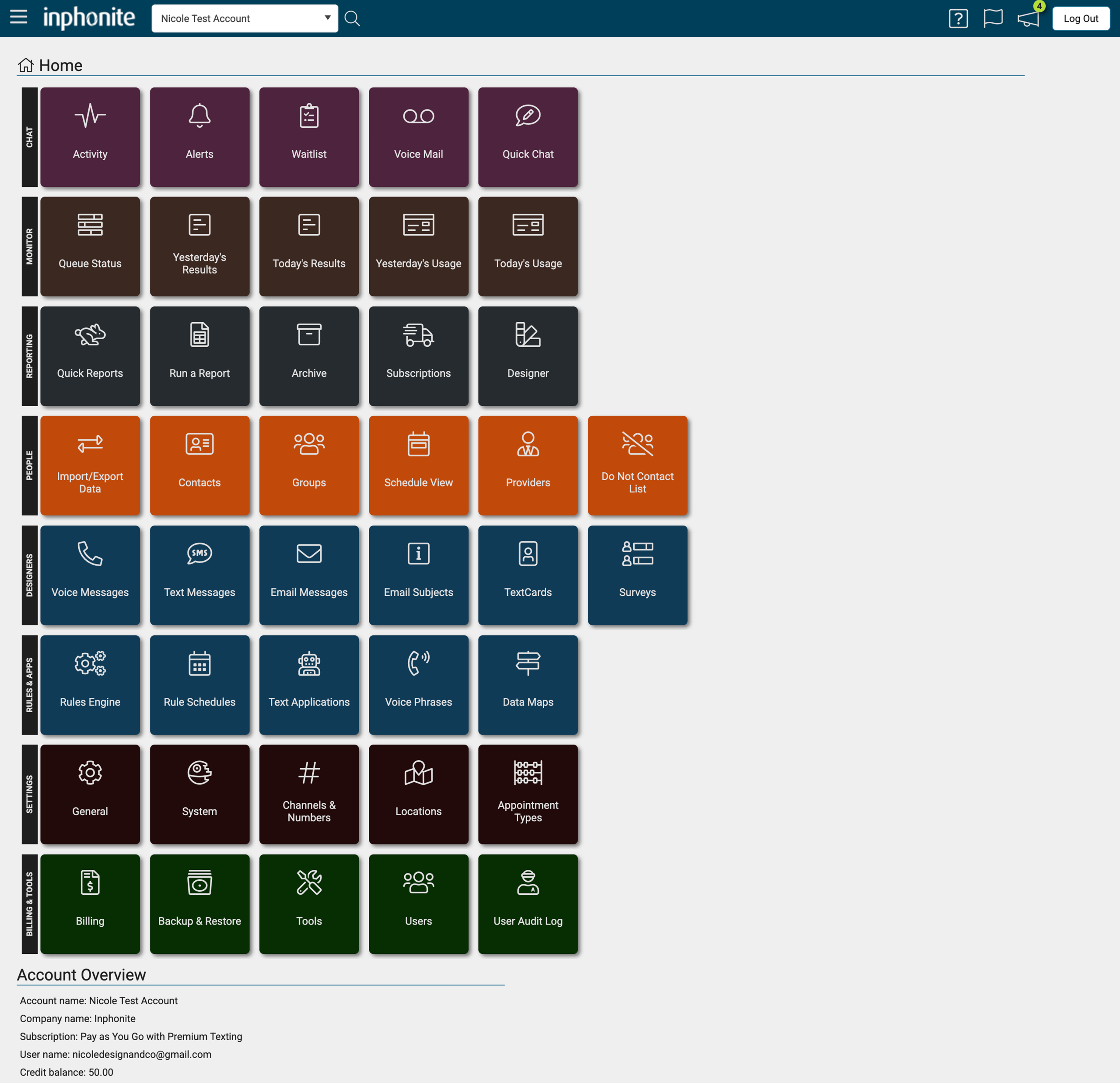
Inphonite’s existing navigation was cluttered and inconsistent, making it difficult for users to locate key tools and workflows. Features were scattered across multiple nested menus, with unclear labeling and no clear information hierarchy.
My Role
UX/UI Designer – Led a collaborative IA workshop to reorganize the navigation structure, improved visual hierarchy, and implemented the redesign using Kendo Telerik components.
Challenges
- The navigation grouped unrelated tools together, creating cognitive overload.
- Visual styling and hover states lacked clarity.
- Users had no quick way to view their account or credit usage.
Process
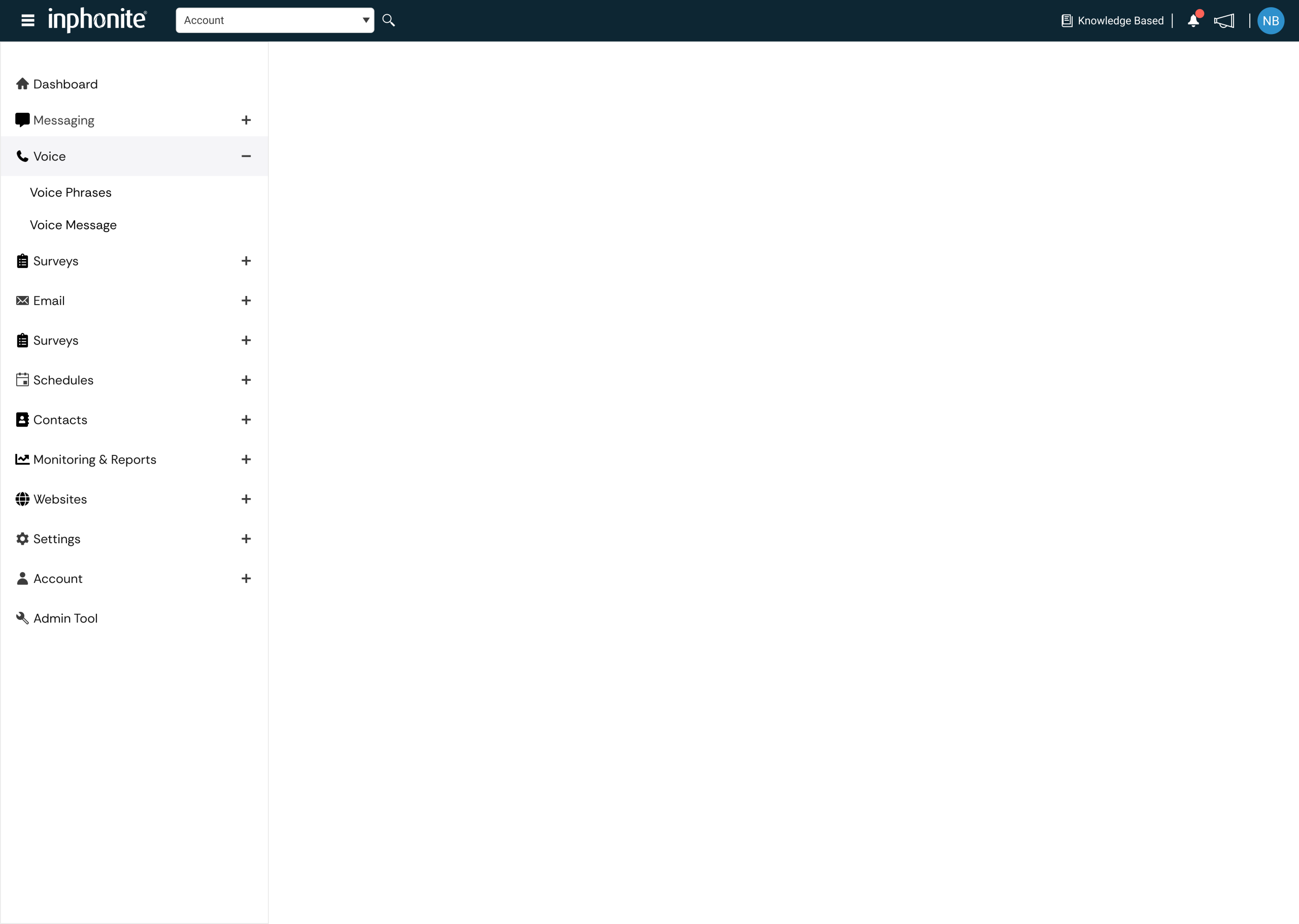
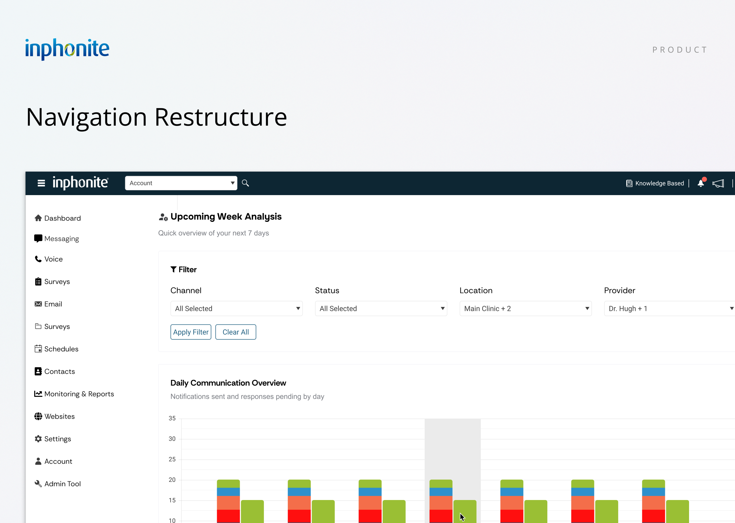
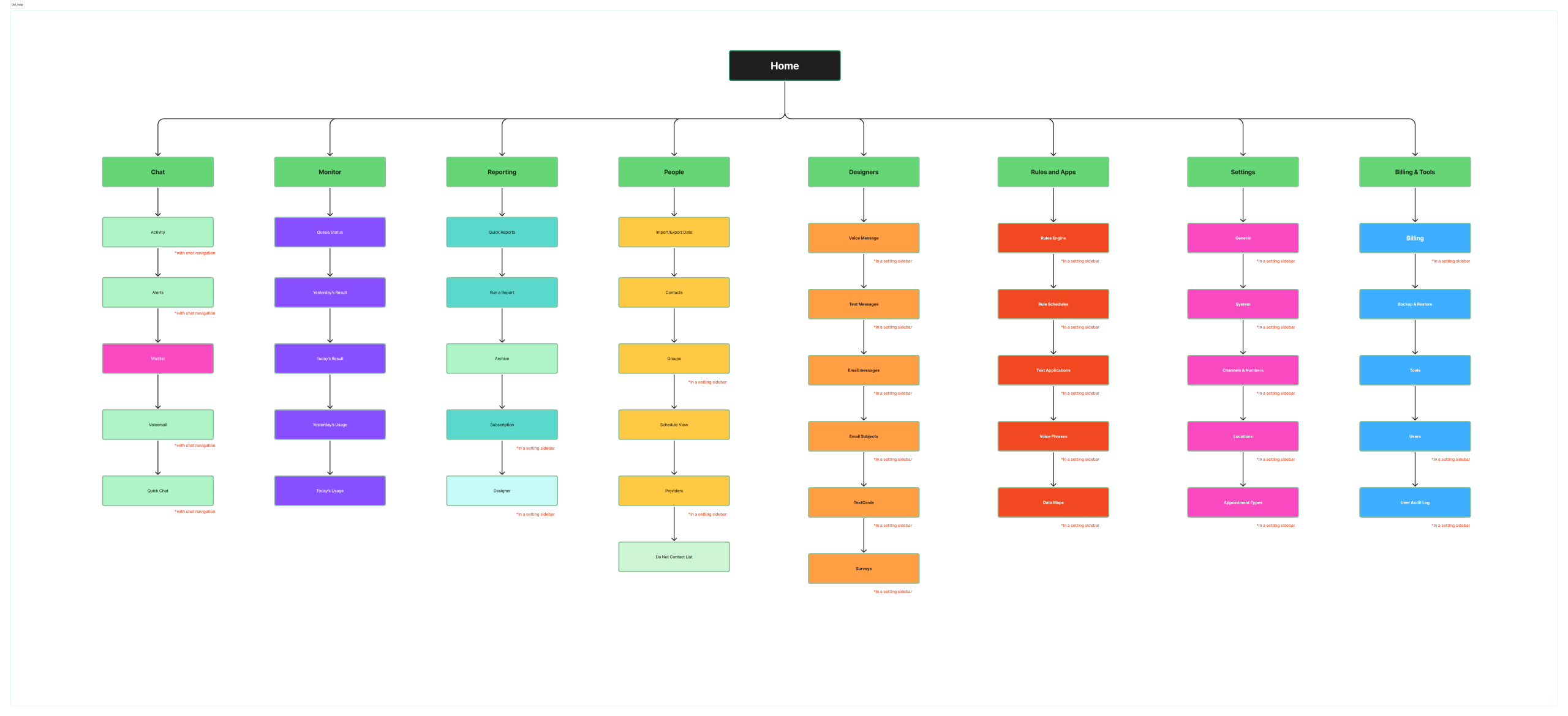
To realign the experience, I facilitated a card-sorting and grouping session with the internal team to identify logical menu clusters. This helped us restructure the navigation into clearer, goal-oriented sections such as Messaging, Voice, Surveys, Monitoring & Reports, and Billing & Tools.
While optimizing the hierarchy, we also modernized the UI using Inphonite’s existing Kendo Telerik library—introducing consistent hover and active states, refreshed typography, and a cleaner sidebar layout.
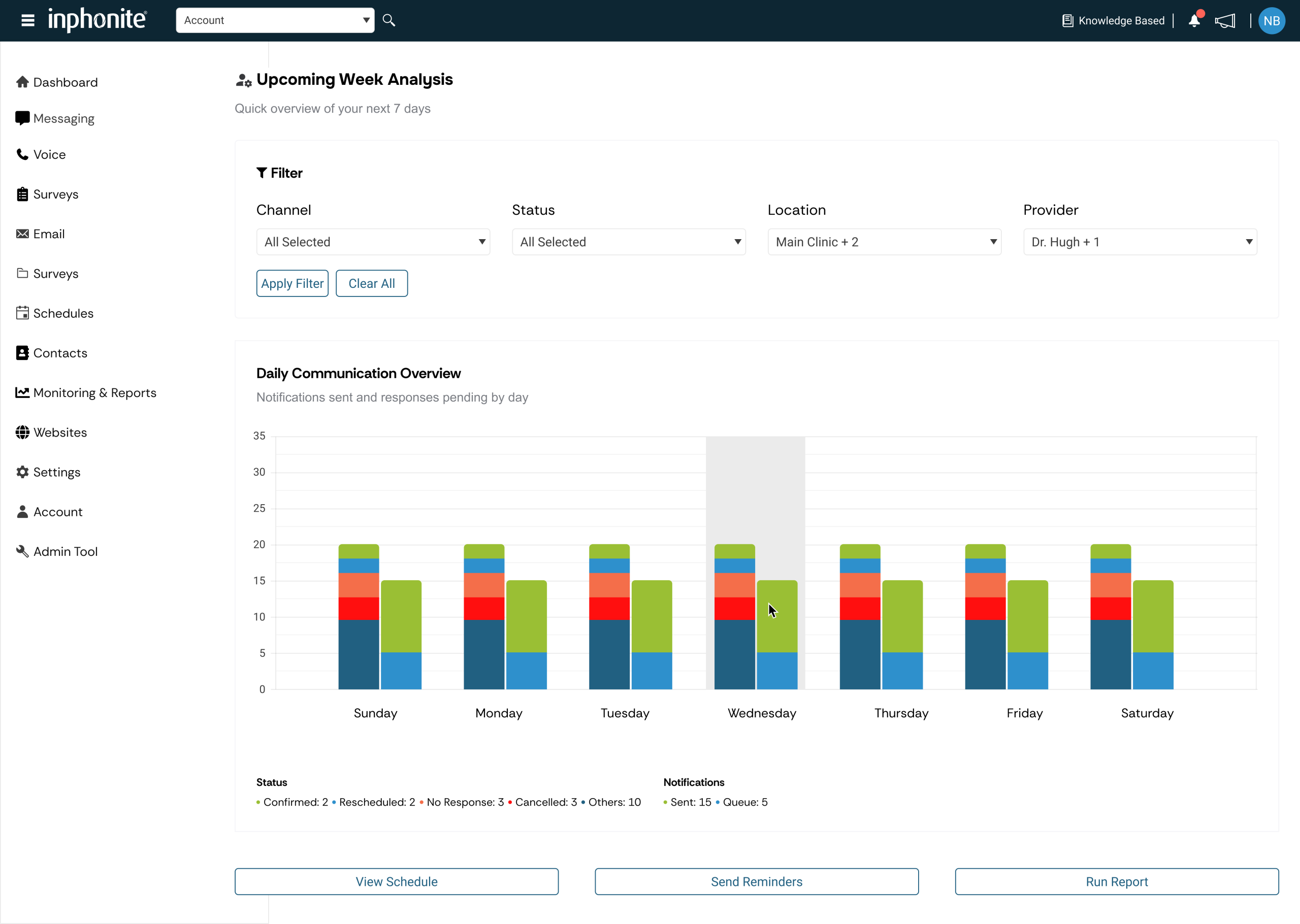
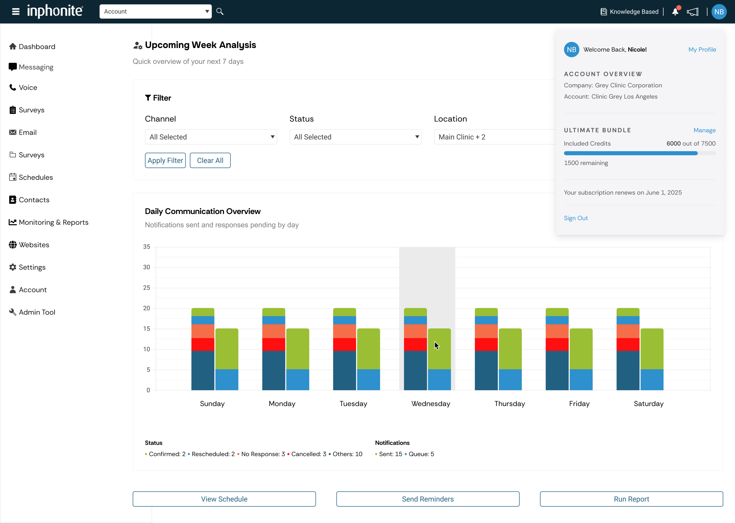
The top navigation bar was enhanced to include credit usage visibility and quick access to account settings—a small but meaningful improvement that reduced user friction during daily operations.
Outcome
- Streamlined navigation with clearly defined categories.
- Consistent UI patterns leveraging Kendo Telerik components.
- Improved user awareness of system credits and account status.
- Faster access to key tools and reports.
Old Navigation
New Navigation