ATRF “MyPension” Dashboard
As a contract Product Designer for the Alberta Teachers’ Retirement Fund, I helped redesign the MyPension portal, simplifying complex financial workflows within a legacy code. The new task-focused dashboard brings pension estimates, beneficiary updates, and key documents front and center, supported by scalable design tokens and WCAG-compliant components.
Project Snapshot
Client: Alberta Teachers’ Retirement Fund (ATRF)
Product: MyPension (member self-serve portal)
My Role: Product/UX Designer (contract)
Focus: Dashboard restructuring, IA cleanup, accessibility, and UI modernization
Tools: Figma, WCAG 2.1 AA, internal design audit
Constraints: Legacy backend architecture, limited dev resources, evolving scope and budget reallocation
The Problem
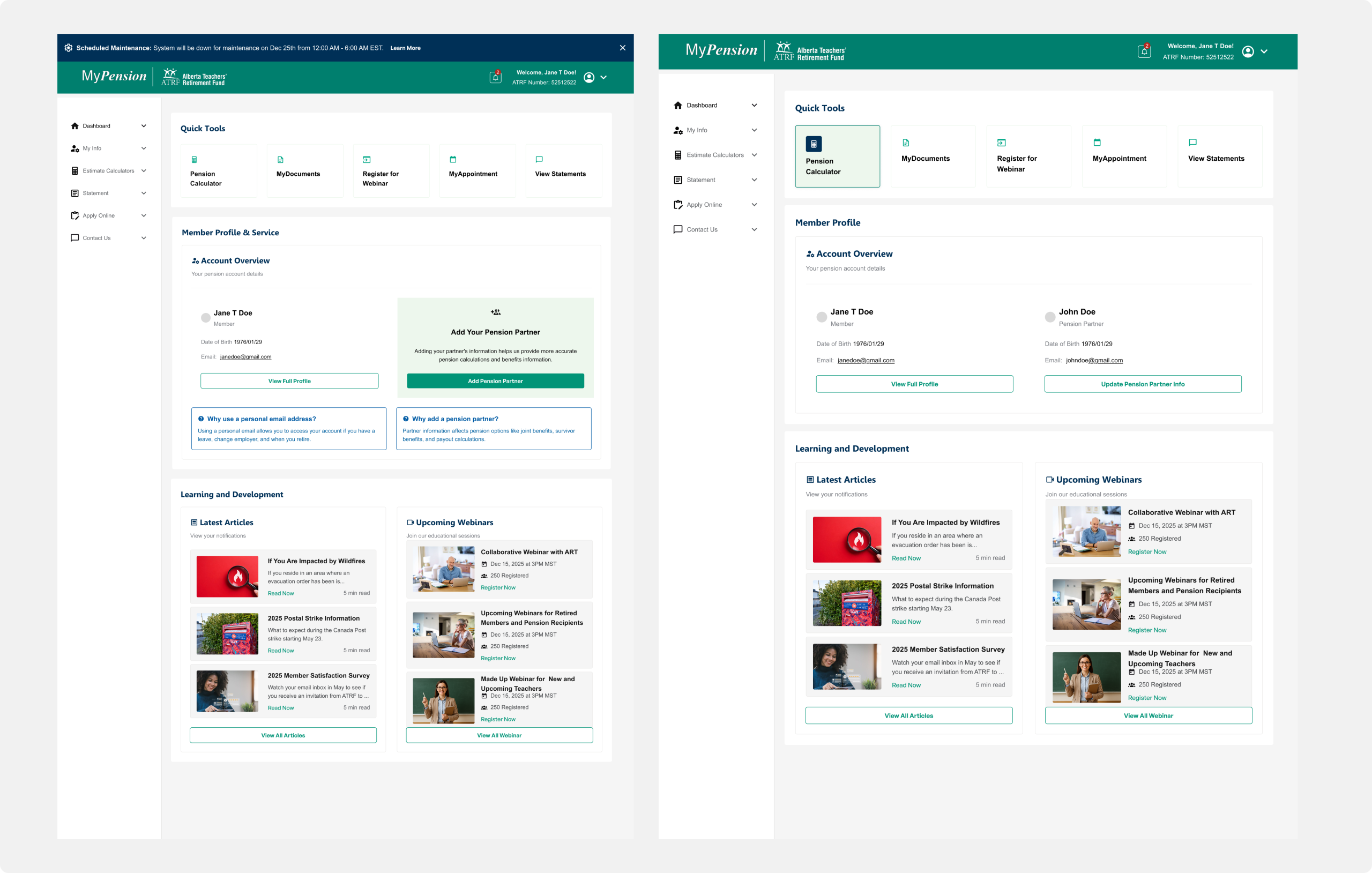
The existing MyPension dashboard had become cluttered and fragmented, forcing members to dig through multiple menus to access essential information like pension estimates, beneficiaries, and documents. The UI no longer reflected modern usability or accessibility expectations.
Key issues:
- Overloaded layout with inconsistent hierarchy.
- Redundant links and poor navigation flow.
- Low contrast and inaccessible focus states.
- Limited responsiveness on mobile.
Objectives
- Redesign the dashboard to make it:
- Task-first: highlight key actions upfront.
- Accessible: meet WCAG 2.1 AA.
- Scalable: provide a base for future design consistency.
- Readable: improved visual hierarchy and spacing.
Process
- Conducted IA audit to remove duplicate links.
- Identified top 5 user actions based on analytics and support data.
- Created wireframes that shifted from text-heavy lists to card-based summaries.
- Validated early iterations with stakeholders before moving into high fidelity.
Solutions
New Layout:
The redesigned dashboard is organized around modular cards summarizing top actions and user statuses. Each card includes a key action (e.g., Update Beneficiaries) and brief context (e.g., last updated date).
Accessibility:
Contrast and type hierarchy improved; every interactive element includes clear focus indicators.
Responsiveness:
Adopted a flexible grid that adapts from desktop to mobile, ensuring continuity across devices.
Impact
- Designed to reduce time-to-task by ~35%.
- Expected 40% fewer navigation-related support tickets.
- Provided clear blueprint for future sections to follow a consistent card-based design.
Learnings
- Task hierarchy drives clarity more effectively than content hierarchy.
- Building accessibility into layout early avoids retrofitting later.
- Even under limited scope, setting clear IA principles has long-term payoff.